The Empty Space That Holds a Drawing Together
Negative space in drawing helps forms read clearly. Learn to compare the gaps around simple shapes and use those relationships to guide attention.
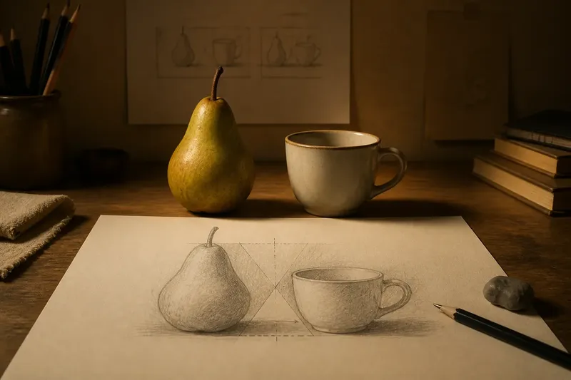
The common mistake in a drawing of simple objects is to watch each shape and ignore the gaps between them. That makes negative space in drawing seem like leftover paper, though a narrow opening or angled wedge can reveal that two forms are drifting apart before either outline looks obviously wrong.
Consider an invented situation: you are drawing a pear beside a small cup on a sheet of warm white paper. You place the pear first, then sketch the cup where it seems to fit. The objects look plausible alone, but the space between them pinches near the top and opens below in a way that makes the cup appear to lean away.
Reading the gaps
Negative space is the area around and between forms, bounded by their edges and the edges of the page. In this drawing, it includes the wedge between pear and cup, the strip above their rims, and the larger field of paper around the pair. Each area has a shape of its own, even though it contains no drawn object.
That wedge is useful because it joins two contours in a single comparison. The pear’s curve may look convincing when studied by itself; the cup’s side may also seem right. But if the gap narrows too quickly, their relationship is unclear. Observing the empty shape gives you a way to check both forms at once without relying on a general impression of “balance.”
Setting the drawing
For this practice, use a sheet of paper, a soft graphite pencil, and a kneaded eraser. Place a pear and a cup on a table with a little air between them, then sit where you can see both forms and the paper edges. A phone snapshot can also serve if you need to compare the arrangement without changing your viewpoint.
Begin with light marks for the outer limits: the top and bottom of each object, their widest points, and the sides of the overall arrangement. These are not finished contours. They give you landmarks for judging whether the pair occupies the page as intended.
Now look at the wedge between the objects as if it were a small, flat cutout. Notice where it begins, where it is widest, and whether its sides converge or stay nearly parallel. Compare that shape with the strip of paper above the cup. If one gap feels cramped while another feels unexpectedly broad, the spacing may need attention before you refine the pear’s stem or the cup’s handle.
Moving from impression to comparison
In the invented drawing, you erase the cup’s first placement and shift it slightly toward the pear. You do not redraw its details. Instead, you check the negative shape again: the gap now narrows more steadily from the lower edge upward, and the small opening beside the handle remains visible. The result is not a claim that the objects are perfectly placed; it is an observable change in how their contours relate.
Try checking the space in several ways. Look at it directly, then soften your focus so individual objects lose some of their detail. You can also turn the page sideways or use a small viewfinder made from a card with a window cut into it. These methods interrupt the habit of naming objects and help you notice simple areas of light paper.
Compare one gap with another rather than judging each in isolation. Is the space above the pear taller or shorter than the space above the cup? Does the opening between the objects feel more like a tapering triangle or a channel with nearly parallel sides? Such comparisons are easier to act on than an instruction to “make it look right.”
Edges that carry attention
Negative space also helps decide where the eye travels. A tight, pointed gap can draw attention to the place where two forms nearly meet. A broad, quiet field around the pair gives the contours room to register. If every opening is pinched, the drawing can feel crowded; if every interval is generous, the objects may seem unrelated.
When the pear and cup are in place, keep the pencil marks around their edges light enough to revise. Darkening one contour too early can make it feel fixed even when the adjacent space is still awkward. Once the main gaps read clearly, you can strengthen selected edges and leave others quieter, allowing contrast to guide attention without tracing every boundary equally.
Negative space in drawing?
How do I draw the space around an object?
Observe the area as a shape with boundaries, then lightly mark its widest point, narrowest point, and direction. Compare those landmarks with the neighboring contour instead of trying to shade the empty area as though it were another object.
Should negative space be shaded?
Shading is optional; the main practice is seeing its shape and proportion. A light tone can help separate adjacent areas in a study, but it should clarify the relationship rather than distract from it.
What if the gaps look different from each side?
They may differ because the forms have different contours, and they do not need to match. Check whether each gap supports the intended arrangement, then adjust the position or outline that seems responsible for an unintended pinch or opening.
Can I practice with shapes instead of objects?
Yes. Draw a circle beside a rectangle, or place two triangles with a narrow interval between them. The simpler outlines make it easier to see how the surrounding area changes when one form shifts or turns.
Keeping the study useful
After the pear and cup read clearly, add only enough detail to describe their character: perhaps the pear’s uneven shoulder and the cup’s oval rim. Pause whenever a new mark makes you lose sight of the gaps. The drawing’s purpose is not to fill every patch of paper but to make the forms and their intervals belong to the same arrangement.
What is not worth the effort is outlining every pocket of negative space with a heavy border. Those borders turn a useful way of seeing into a separate diagram and can compete with the objects. A few light guide marks, followed by careful comparison, are usually enough for this exercise.
For another round, keep the objects fixed and change only the paper framing, or move one object and observe which gaps change first. Negative space in drawing becomes a practical guide when you can point to a particular opening and say what its shape asks you to reconsider. That small, visible decision is often more useful than adding another line of detail.